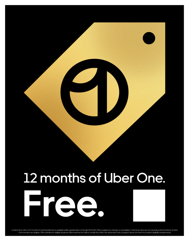
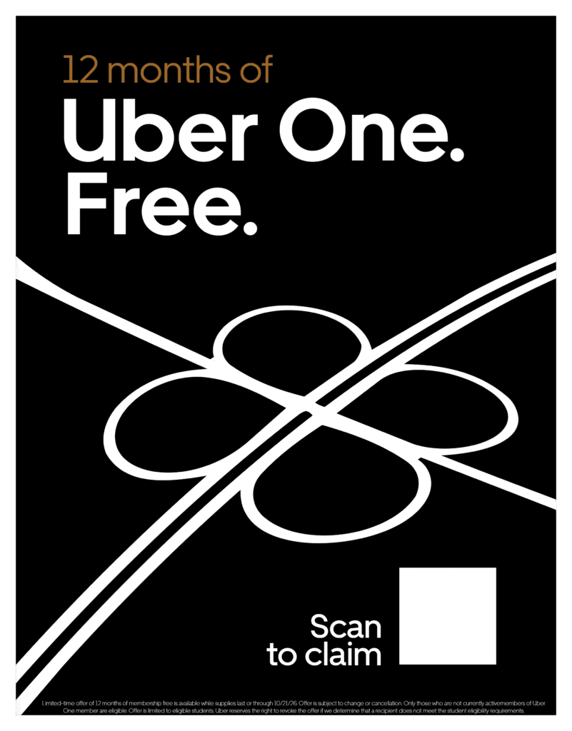
These Uber One graphics focused on creating a simple design that fits into the language of the company while still being eye catching and engaging. The first design focused on the Uber One Logo itself and looked towards creating the tag motif found in other promotional materials. The Second flyer looked to replicate a highway on ramp that also looks like a four leaf clover.
These graphics were made for posting on Instagram specifically on stories. These focused on following a solid color scheme and interesting shape language. The first focuses on the speed of the car illustration, The second focuses on the flowing and winding streets you experience as a passenger in a car.